Brand Guide
Symbol
Our symbol can be used in a variety of settings (app icon, favicon & social media avatar), allowing us to communicate the brand without necessarily saying our name.
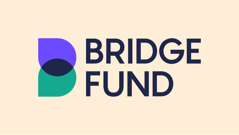
Logo
The primary (solid) logo should be used as much as possible. The logo could also be animated.
We use the secondary (outlined) logo, if we are limited in colour usage or when it’s better for the composition.
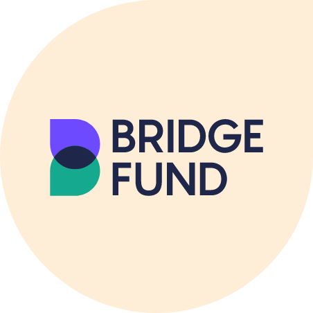
Bubble logo
In some cases we show the primary logo in a bubble shape:


On a black or white background.

On a fullscreen image or video.
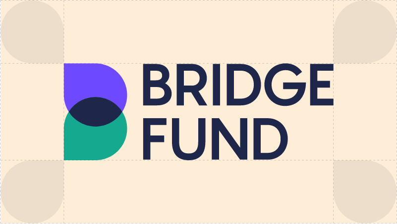
Logo size & space
Our logo needs a space of at least one bubble around it. Also in the bubble logo.
Minimum logo size:
Digital — 24px high
Print — 8mm high

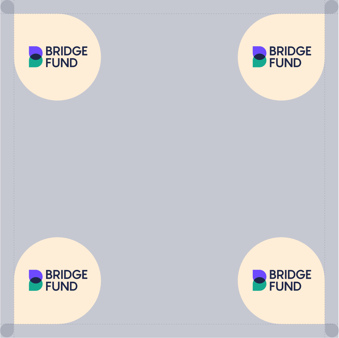
Position
By placing the logo in a corner, it is clearly visible and doesn’t take up too much space.
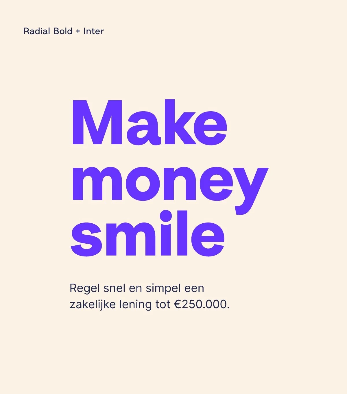
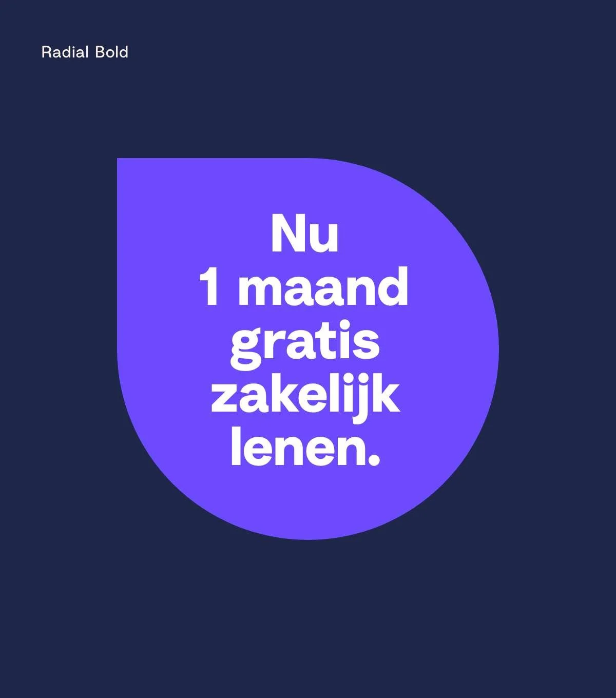
Typography
The BridgeFund typography is mainly based on the two typefaces — Radial and Inter.
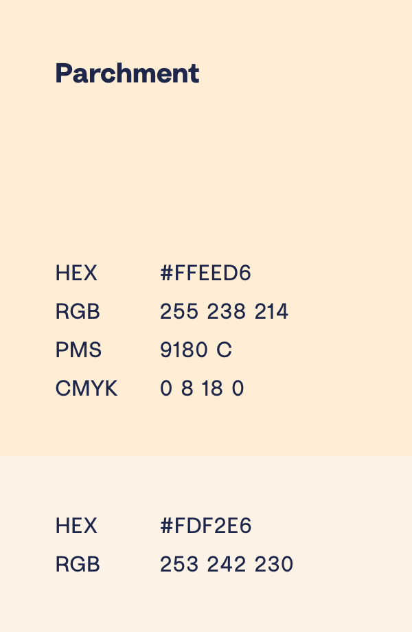
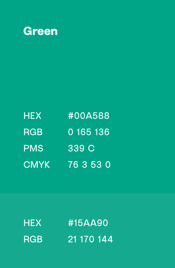
Colours
In every communication we use the primary brand colors (dark blue, purple, green and parchment).
You can use shades of these colours. In addition, the use of pastel colors as an accent color is also allowed.


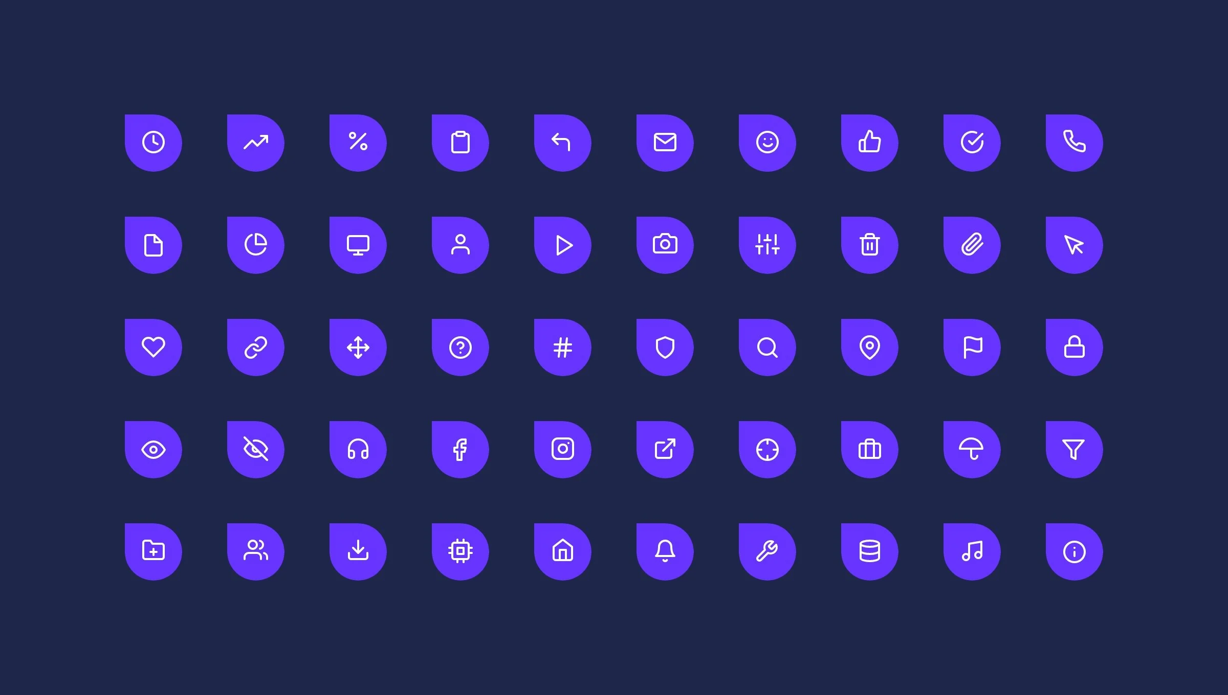
Icons
We use simple but bold line icons and place them, most of the times, in one of the symbol’s bubble shape.
Shapes
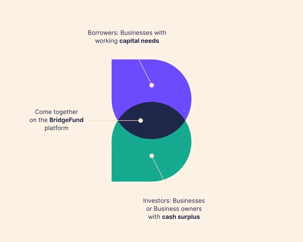
All shapes are extracted from the symbol and therefore ensures recognisability. The symbol’s bubble shape can be used as a frame for text, photo’s and icons or to add some colour to a background.


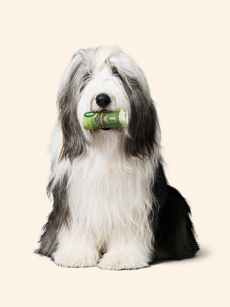
Photography
The people in our photography are real entrepreneurs and real employers.
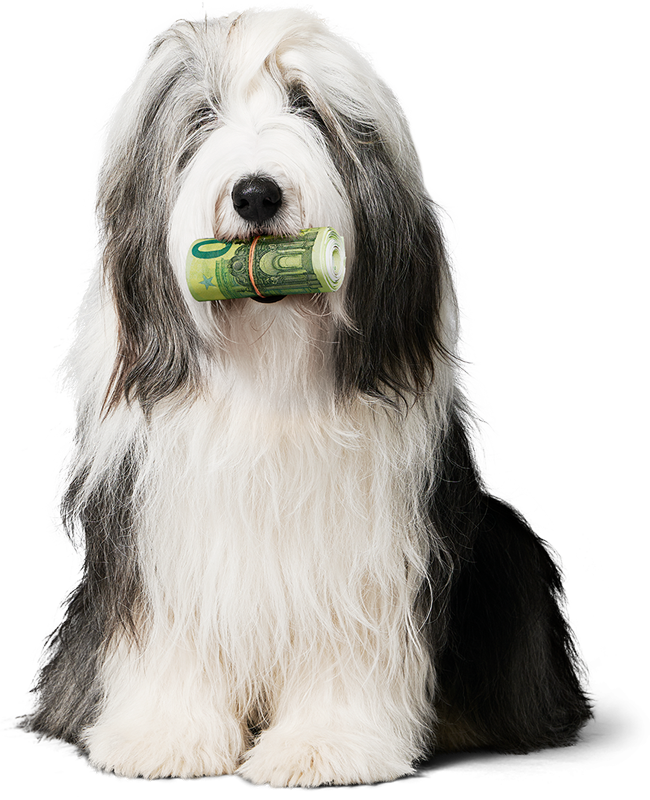
The only exception from that is our mascotte Ted. He’s not really our dog, but nevertheless very useful to the BridgeFund brand.
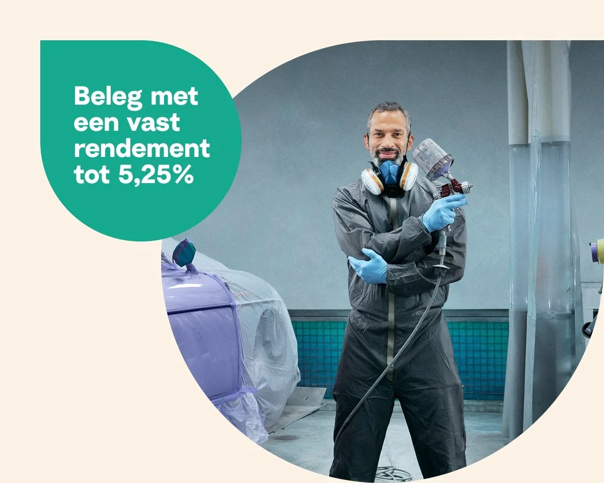
Campaign
These images are the keyvisual for the Investors campaign 2024.


Motion
The motion in the BridgeFund animations is relaxt and in service of the message.